

Five stages of accepting provably robust anonymization
This post is a transcript of an invited talk I delivered to AnoSiDat in April 2024.
Hi everybody! I’m Damien.
I’m about to do something they always tell you not to do when you give presentations, and that’s “speak about myself for a little while”.
I will to try to make it into a story though, so maybe it’s OK. You tell me.
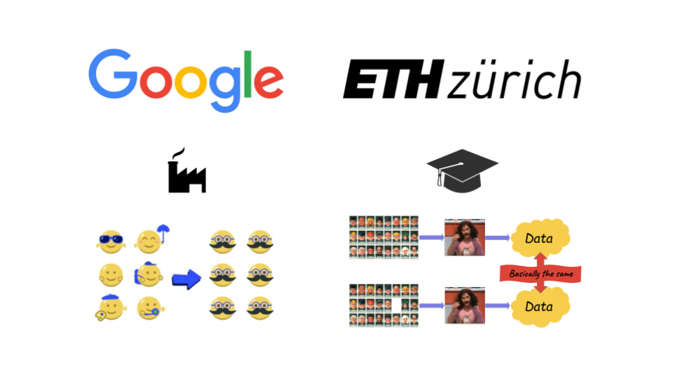
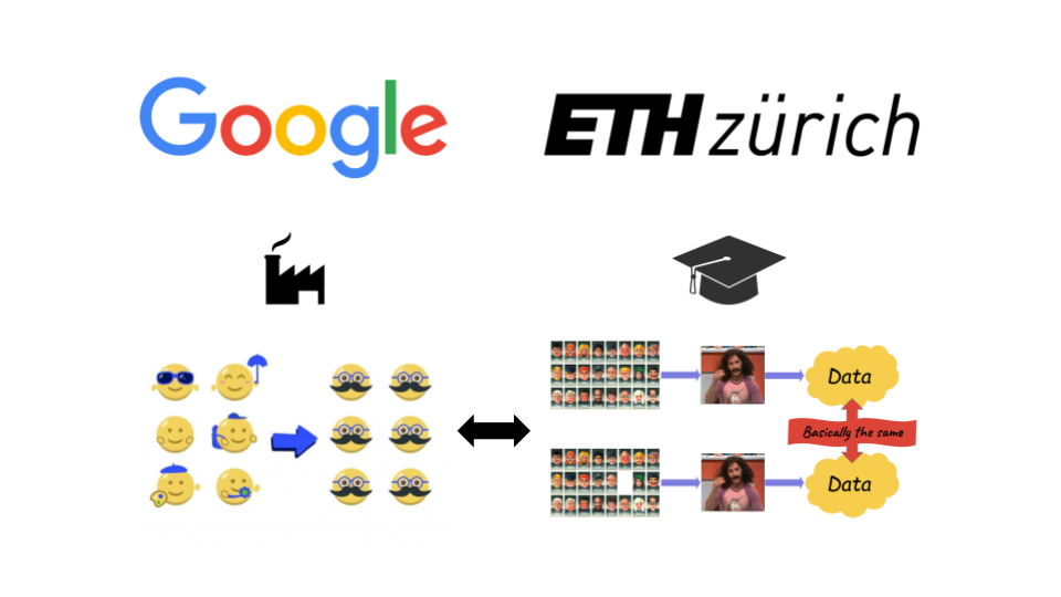
In 2016, I started splitting my time between my job at Google working in the privacy team, and pursuing a PhD at ETH Zürich.
On both sides, I was working on anonymization. And anonymization had something very puzzling about it.
At Google, and in the rest of the industry, people mostly used notions like k-anonymity. The idea is to people into buckets of sufficiently many other people that they’re “basically anonymous”.
It wasn’t always k-anonymity. It could be other notions based on an intuitive idea of what anonymous data should look like. The general idea was to try and see what could go wrong with a certain method, and if we couldn’t think of anything, we’d say: it’s probably good enough.
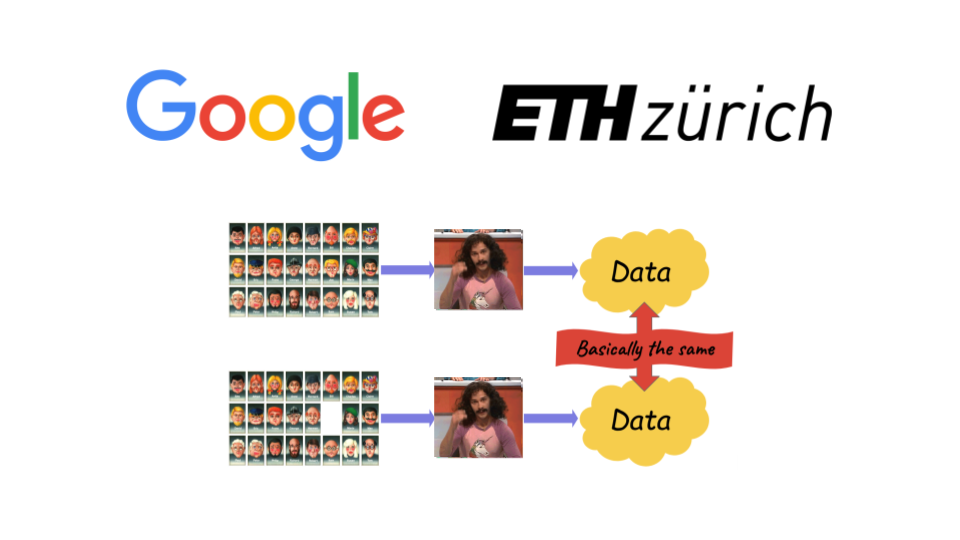
In academia, though, especially among computer scientists, everyone seemed to have converged on another notion: differential privacy. DP, as we like to call it, is not just a new criterion to decide whether data “looks” anonymous enough. Instead, it’s a completely different approach, grounded in math. It tells you: there’s bad news and good news.
- The bad news is that anything you publish will leak some individual information. You just can’t escape that fact.
- The good news, is that you can quantify this leakage and limit it, regardless of the attack.
A lot of people seemed to have seen this new concept and gone like: this is it. Not only is the math satisfying, but this is the right notion, on a political or even moral level. That’s how we really protect the people in the data.
That gap between practice and theory seemed weird to me. It looked like two separate worlds who weren’t really speaking to each other.
So I thought: could we try and bring the two worlds together somehow? That was the big problem I wanted to solve during my PhD. I looked at older notions of anonymization, or practical tools used in industry, and asked: could you quantify their leakage in the language of DP? Maybe show that they’re not that bad, and that they do provide good guarantees in practice?
That didn’t quite work out.
Instead, I became a lot like these folks in academia: I started focusing much more heavily on differential privacy. I became convinced that this was the future, not just in academia, but for real-world use cases in industry as well. At Google, my team even tried to make it into the default approach used for anonymization. We made a ton of progress in that direction!
Now, I’m at Tumult Labs, a startup that tries to make that happen at the scale of the entire industry. Our goal — my job — is to make differential privacy into this thing that everybody uses.
Kind of like cryptography. If you’re not using HTTPS on your website today, that’s bad. People are like: “Yo, that’s unsafe. You’re putting your users at risk. Do better.”
My dream is to live in a world where if you’re claiming to anonymize some data, and you’re not using DP… that’s kind of suspicious.
A few years ago, I thought this industry-wide shift would happen very soon. Any day now.
Except: it’s not really happening. Or maybe it kind of is, but it’s moving much more slowly than I expected. Take a random government agency that publishes statistics about people. Or a random company sharing anonymized data with a third party. What are the chances they’re using differential privacy? Not great.
That divergence between communities I observed 8 years ago? It’s still there. If anything, it got worse.
Many academics and practitioners just… don’t use newer, more robust notions. Instead, they keep doing the thing they’ve done for decades! At least, that’s what it looks like from where I’m standing.
And the differential privacy community — my community — has developed a sort of arrogance about people who haven’t made the switch. To us, differential privacy is so obviously the right approach. If you’re not getting it, there must be something wrong with you.
In fact, you might feel exactly this way about me based what I’ve told you so far. “Urgh, another guy who’s going to lecture me about how I do anonymization.”
Or maybe you are focusing on differential privacy, and I’ve just called you arrogant, and now you’re like “who does this guy think he is?”. I’m making everyone unhappy. This talk is going great. You’re so glad you’re here.
In all seriousness though, I do think that as a community, we’re not doing enough to understand people who keep using ad hoc anonymization. We’re not really listening to what they’re telling us, or being empathetic to their experiences. And… that doesn’t feel right. That doesn’t feel very productive, either.
So in this talk, I’ll try to do better.
I’ll attempt to truly engage with the arguments of critics of differential privacy. Make sure I “get it” by making them mine. Fully understand the challenges in the way of our grand vision, and try to figure out how we, together, can address them.
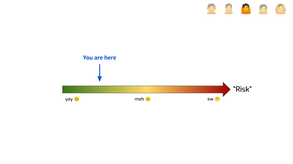
I’ve named this talk “Five stages of accepting provably robust anonymization”. The stages, are, of course: denial, anger, bargaining, depression, and acceptance.
It’s silly, of course, especially since my understanding is that these “five stages of grief” model is actually kind of outdated in psychology.
But discussing questions like “how do you define privacy” can actually be pretty emotional, for people like you and me. We care about this stuff. We do privacy because we want to do the right thing. We want to build better, more respectful ways of handling and sharing and publishing data. So when someone goes and say “the way you’re doing this is all wrong”, it’s not just an intellectual dispute. It makes us feel things.
So, we’re going to go on a journey, and it’s going to be an emotional journey.
Let’s dive in!
The first phase is Denial.
We don’t actually need differential privacy. Whenever folks doing differential privacy do their “anonymization 101” lecture, it’s always the same story. First they come in, and start explaining some classical reidentification attacks. The governor of Massachusetts reidentified by Sweeney! AOL search queries! The New York taxi dataset! The Netflix prize dataset! Then, they go: “This stuff is bad, and it could happen to you. You need DP to make sure that you mitigate against that.”
But let’s be honest. This isn’t very convincing.
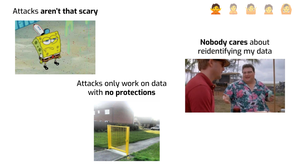
First, these attacks are honestly kind of underwhelming. The risk just seems overblown. Who cares if we figure out that the person who watched some movie also watched this other movie? Or if we can reidentify a couple of celebrities’ taxi trips? OK, this isn’t supposed to happen, but… nobody’s actually harmed in real life by this stuff.
Plus… this is purely academic work. In real life, people won’t investigate your data on the off-chance that they’ll reidentify one person! Unless they’re people are academics trying to prove a point. What are the chances this happens to me?
And also, in all attacks, the datasets were obviously badly protected. Of course removing names is not enough! Of course search engine queries are reidentifying! Their problem wasn’t that they weren’t using differential privacy. Their problem was that they didn’t even try! If they had thought about it for more than 5 minutes, and used any reasonable scheme to protect data, they’d probably have been fine.
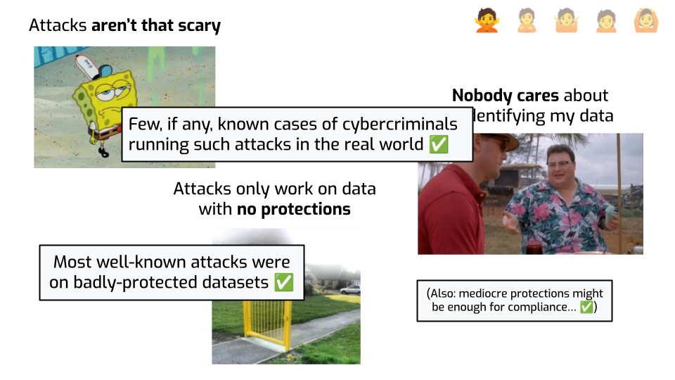
These arguments are honestly pretty valid, and I wish we’d admit this more openly in the differential privacy community.
First: most attacks, especially the shiny ones that got press coverage, were done on datasets that were pretty embarrassing. It makes total sense to see this and think: if I do my homework and try to do something reasonable to protect my data, that should be enough to make sure bad things don’t happen.
This can also be the case for compliance-based motivations for anonymization. You know that joke about how, to escape a bear, you don’t have to run faster than the bear, you have to run faster than the slowest person running from the bear? Let’s be real: some people feel this way about data protection authorities. Regulators are still at the stage where they have to tell people “hashing identifiers is not anonymization”! If you can demonstrate to a regulator that you did something reasonable, surely they’re not going to be mad because you didn’t use the gold standard, right?
Finally, it’s totally fair to say: “look, I know I have to do cybersecurity stuff, I’m going to get ransomware otherwise”. The risk is real, it’s tangible. We’ve all received emails like “we deeply care about your privacy, also all your data got stolen by random hackers”. We know it happens all the time. Re-identification attacks… not so much. The risk just isn’t that huge.
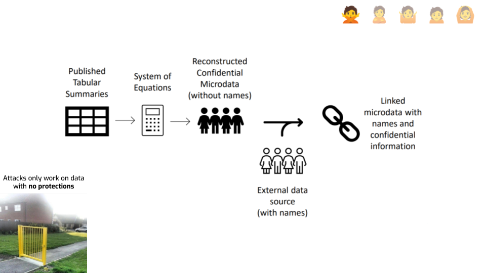
First, let’s look at the last argument that risks only exist on “obviously unsafe” data releases. One piece of data that doesn’t quite go in this direction are reconstruction attacks. Like the one the U.S. Census did on their 2010 data.
Here’s a diagram giving a rough ideas of how it works. The idea is remarkably simple: you consider every published statistic as an equation with a bunch of unknown variables — one per unknown attribute in each record. And then you simply… solve that system of equations. If you have enough statistics, you can just do that. This gives you reconstructed records. You went from statistics to actual individual records. If a bunch of those are correct, that seems bad.
The attack doesn’t stop there, though. It has a second step: you use an auxiliary dataset to link each reconstructed record with an actual person, and learn something additional about this person.
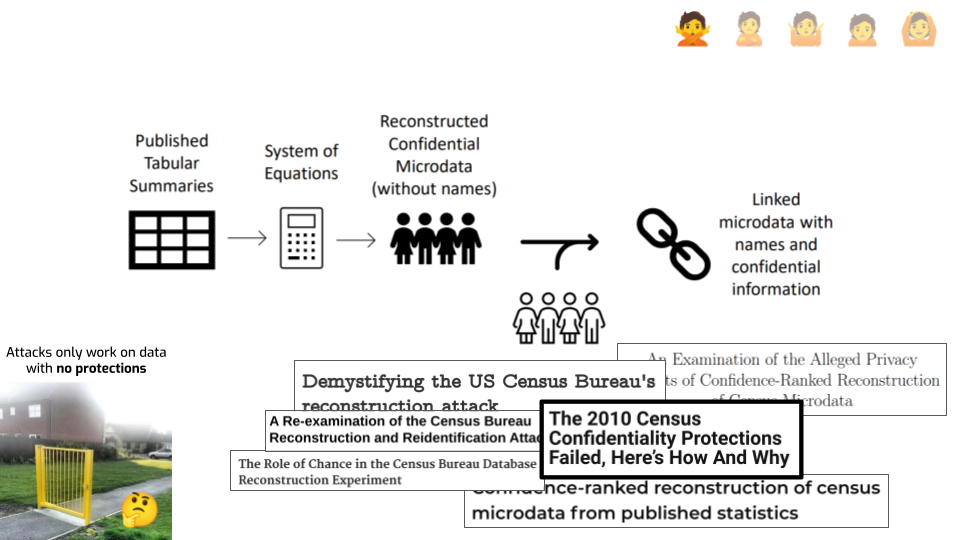
It’s fair to say that the attack was far easier, and far more successful, than people expected. It was a real wake-up call inside the U.S. Census Bureau. Plus, it was done on the data from 2010, which used well-researched disclosure avoidance techniques. So, that argument from earlier that attacks only happen on datasets that are “obviously” badly protected… It’s starting to look a little iffy.
There’s still some debate about this attack, though. The initial description of the U.S. Census reconstruction attack did not give a lot of detail about how it worked, and people had opinions about its validity. One common question was around how to quantify the success of attacks, and against which baselines to compare it to. I’m not going to relitigate the argument here. The Census recently published a much more thorough technical description of what they did, which I think puts to rest a lot of the technical debate. You should read it if you want to learn more.
But this debate undoubtedly raised some good points and questions around what it means for an attack to be successful, and how to actually demonstrate attack success.
Another way people have criticized the attack is by saying — let’s be real. Census data isn’t that sensitive. It’s just demographics: gender, age, racial information. It’s not like medical data. Nobody would go through all this trouble just to figure out “oh, this person’s age is 42”. Even if you reconstruct & reidentify a Census record, you don’t really learn anything new and sensitive about that person.
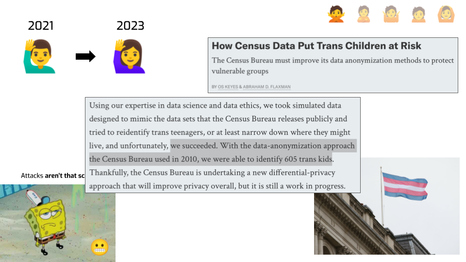
Here’s something you can do with this statistical releases of this kind.
- You can take data from one year, reconstruct and reidentify some records…
- … then you do the same attack on a more recent data release…
- … and you answer a simple question: “who reported a different sex/gender attribute since last time”?
That’s exactly what two researchers did. They showed you could reidentify hundreds of trans people based on statistical releases. In the current political climate… I don’t know about you, but that scares me.
There’s a hard lesson in this: the real world will always find a way to surprise you. Not just in “how could an attacker do this nefarious thing”, but also in what nefarious thing can even be the goal. I’ve seen some bad stuff working on privacy in the industry for 10 years, but this attack still caught me by surprise.
![A slide with the "Nobody cares about reidentifying my data" picture from the
previous slide and additional elements. A screenshot from a paper reads "As one
prominent state demographer recently pointed out at a Federal State Cooperative
for Population Estimates meeting “in past censuses, it was possible to create a
PUMS-like [PublicUse Microdata Sample] file from the SF1 tables [i.e., decennial
census publications]. It was just a pain in the neck”". An infographic shows
dozens of ad tech companies in different parts of the ad tech
industry.](https://desfontain.es/blog/images/anosidat-14.png)
Let’s look at the last point — nobody cares about reidentifying your data.
Here’s a real quote from a demographer in USA, complaining about the use of DP in the 2020 Census. “In past censuses, it was possible to create microdata from statistical tables, it was just a pain.”
This is from a meeting Census folks had with some of their data users. This person is just saying out loud what everyone is doing. People do reconstruct data in order to do gerrymandering, political targeting, or any kind of research that would be made easier if we had microdata. This is an open secret.
Speaking of open secrets… have you heard of the advertising industry? There’s a five-hundred-billion-dollar world who’s predicated on showing ads to precisely the right people, and having measurements that are as precise as possible. Data flows left and right, and companies have major financial incentives to run exactly this kind of attack, to get more information than what they’re supposed to.
The fact that you don’t hear about this kind of thing in the press doesn’t mean it’s not happening. Nobody has any interest in publicly talking about it — not the people doing it, not the people that sell data and then get it exploited, not the people buying or using it. So it’s another one of these open secrets.
Want to know the worst thing I’ve heard? There was a startup in the US that was reconstructing & reidentifying Census records and linking them with medical info to better target health insurance advertising. Again, the real world keeps surprising you…
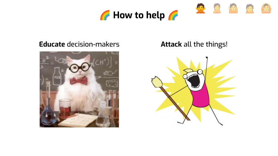
How can we move people past the denial stage?
First, we need to do a better job at educating people, and especially decision-makers — think data protection officers, regulators, product owners — about the risks of bad anonymization. Both about what can go unexpectedly wrong, and how that can happen. We can’t keep using the same examples we used 10 years ago.
Second, attacks are extremely valuable both to our academic understanding of real-world privacy risk, and to the larger societal conversation about what anonymization should protect against. Go look at what your government is publishing, or what kind of data sharing is done as part of your healthcare system. Try to understand what makes sense as an attack, what makes sense as a baseline, and how to actually demonstrate real-world risk. Just a few examples can go a long way in making people aware of a problem they didn’t think about so far.
The second stage, after denial, is Anger.
So, I’m a data scientist, I’ve been tasked to anonymize some data, so I thought I’d give differential privacy a try. I picked up an open-source library that does differential privacy, and tried to use it to solve my problem.
And I have one question.
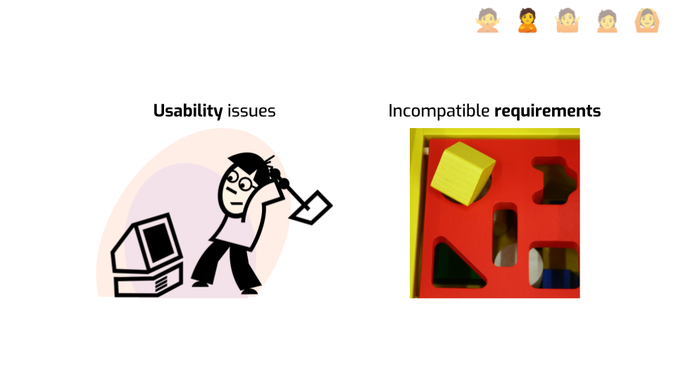
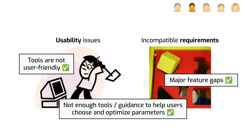
Why is it so hard to do anything?!
Why do I need to learn so many new concepts? Why is this not integrated with the tool I’m normally using? Why is this so slow? OK, those were multiple questions. What the hell, though?
Also… it seems like I can only do simple analytics queries? Don’t get me wrong, a large part of what I need to do with data basically boils down to group-by count or group-by sum queries. But sometimes I need to do more complicated things! Like… Linear regression? Naïve Bayes classification? Anomaly detection? What am supposed to do if I need any of these?
Who in the audience has tried using DP libraries? Do you relate with that experience? I see some people nodding… Yeah. The anger is, honestly, justified.
It’s our job to make this stuff easy to use, and we’re simply not doing a great job. You can’t just run an SQL query that does some simple aggregations and get good results. You still have to learn about epsilon, and probably delta, and maybe even rho and other weird parameters.
And even if you do, it’s unlikely that you will be able to solve your problem on your own. Real-world problems still often have requirements for which there is no good guidance, so you’ll probably need to hire an expert to even think about using the stuff. These can be because the necessary algorithms are still cutting-edge research, or simply because the context is somewhat unusual.
Even in the best of cases, where the tool actually solves the problem, there’s are big questions about how to optimize the algorithm and choose its privacy budget. There’s very little guidance and even less tooling that helps people understand trade-offs.
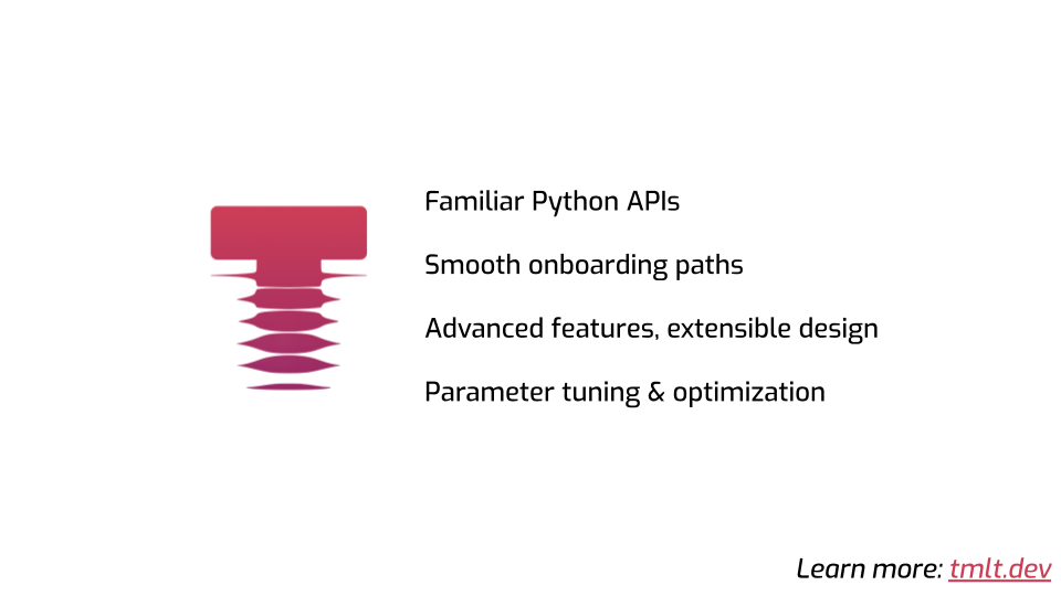
At my company, we develop Tumult Analytics, which we think is the best-in-class DP framework. These problems are top of mind for us, and we try to address them. Things are getting better!
Here are some things we try to do to improve the status quo.
- Our tool is in Python, and its API mirrors the API of PySpark or Pandas, which helps people learn fast.
- We invested a lot of time making a user-friendly tutorial series that helps people learn what they need to use the tool.
- We have a number of unique features that our clients need in their production use cases, and the framework is built for extensibility, allowing ourselves to easily add more capabilities in the future.
- Finally, we just shipped the first version of our parameter tuning & optimization features to a customer. Stay tuned for the public launch! (Or if that sounds interesting to you, come say hi!)
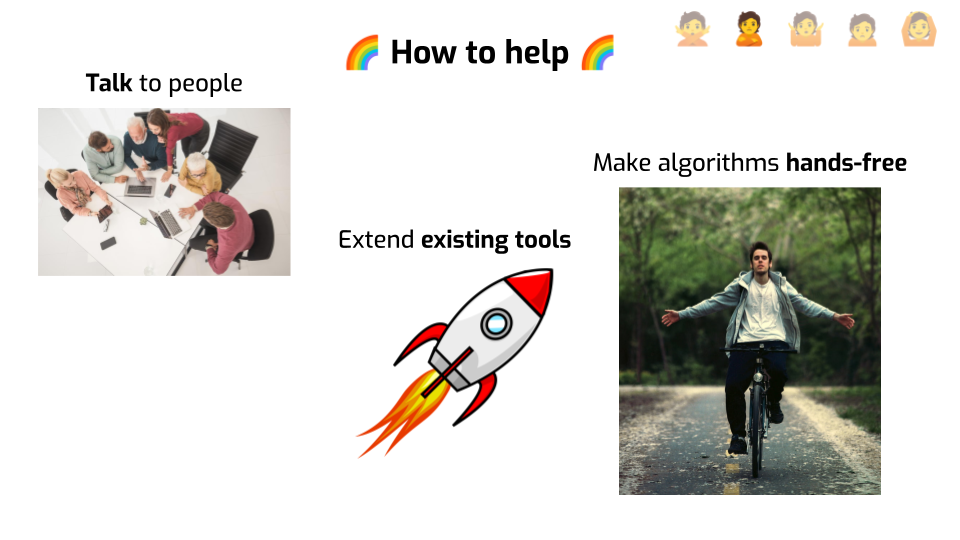
How can you help here?
First: talking to people. What do I mean by this? Things like: running usability studies to understand how to make tooling more user-friendly. Interviews with potential users to understand their needs and identify gaps. Writing more simple explanations of this stuff for wider audiences. Collaborating with people outside of your field, especially if you want to apply DP to a new field of application. Building bridges. Solving other people’s problems.
Second, when you make a new thing… why not extend existing open-source tools? Some frameworks, like Tumult Analytics or OpenDP, are designed for extensibility, so adding new things is easier than you’d think! The additional work is not huge, compared to doing the actual research or writing a paper. And when it’s super easy for people to reuse your work, you tend to get a lot more exposure & citations!
Third, if you make up new differential privacy mechanisms… make them hands-free? What I mean by that is “get rid of the hyperparameters”. Every single parameter that needs to be set manually is a big usability hurdle. So it’s worth figuring out — can we spend a little portion of the privacy budget to automatically select good values for these hyperparameters, rather than asking the user? End users will thank you!
The third stage is Bargaining.
I’ve gone through denial already. I realize that there is a real problem, and that it’s worth fixing. After I got angry trying to use DP in practice, I started looking for alternative solutions. And I think some of them make sense! Hear me out.
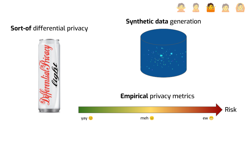
First, I thought — what if I take some shortcuts? Maybe I can just add the same kind of noise they use in DP, but without doing all the rest of the annoying stuff? Like, adding some Gaussian samples in SQL or Excel to my statistics should be good enough, right?
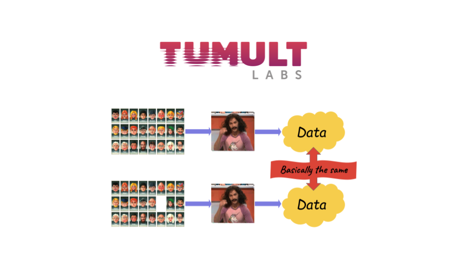
But then I had an even better idea: synthetic data! If I make synthetic data out of my original dataset, surely that’s safe enough to share and publish, right? The records aren’t real! They don’t actually correspond to anyone! It seems to me that by definition, it breaks linkability, and nothing in there can be reidentifiable.
I had some lingering doubts about the safety of doing that, but then I talked to a synthetic data vendor. And he had a really compelling argument: empirical metrics. He said: “I’m not saying it’s always safe, but we have ways to verifying whether the data you generated it safe enough. We can run tests and compute a privacy score that tells us whether the data you got is anonymized enough.”
That sounds great to me!
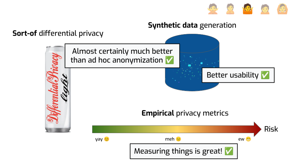
Let’s be clear. This is already so much better than pretending the problem doesn’t exist.
Obviously, just adding Laplace noise of scale 1 to a sum of salaries in euros is not doing much. But if you try do DP, but maybe your noise is not cryptographically safe, or your sensitivity calculation is a little wrong… probably it’s better than not trying at all. Similarly, using synthetic data is much better than sharing the original dataset with the identifiers removed, or using a known broken approach. Academics will tell you: this isn’t a silver bullet! There are attacks on synthetic data that can retrieve the original information! But it’s also true that these attacks are not as convincing as the ones on de-identified datasets, or even reconstruction attacks I talked about earlier.
It’s also understandable that people want to do that, when existing DP tools don’t solve their use case, or aren’t integrated with their existing workflows. Rolling your own anonymization by hand can seem much easier. Plus, sometimes, when you tell people that the first step to use DP is that they have to aggregate their data, you kind of lose them from the start. Synthetic data feels much more palatable, understandable. And the user experience can be pretty smooth. Press a button, you’re done.
Finally, efforts to quantify privacy are laudable. Having a metric for something allows people to draw comparisons, make data-driven decisions, rely on something concrete.
Plus, when you’re an engineer or a data scientist, a nice number just makes you feel warm and fuzzy inside. And when the number go up or down? Brrrr. Feelings.
I’m joking, but this isn’t a bad thing! It’s great to use this as an emotional lever to encourage people to take better privacy decisions! We should absolutely measure and quantify things!
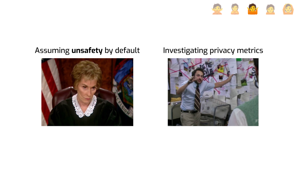
Ask a DP expert to push back against these and they’ll tell you “there’s nothing that shows it’s safe, so we should assume it’s not”. Honestly, we find it even annoying that you’d ask us to make this case. It’s so obvious! Look at cryptography! They learned the hard way that everything should be grounded in math. You made a new fancy encryption algorithm but you can’t prove it’s safe? Get out of here!
But let’s be real: the outside world doesn’t see things this way. Especially not with anonymization. Not yet. We’re just not going to win this argument on philosophical grounds.
So instead, let’s look more closely at these bargaining alternatives — synthetic data and empirical privacy metrics. We’ll need to dive a little deeper to figure out how to properly engage with this argument. How does one measure privacy, actually? Where do the warm and fuzzy numbers actually come from? As you can guess from the picture I chose there, it’s going to be somewhat of a rabbit hole. Bear with me.
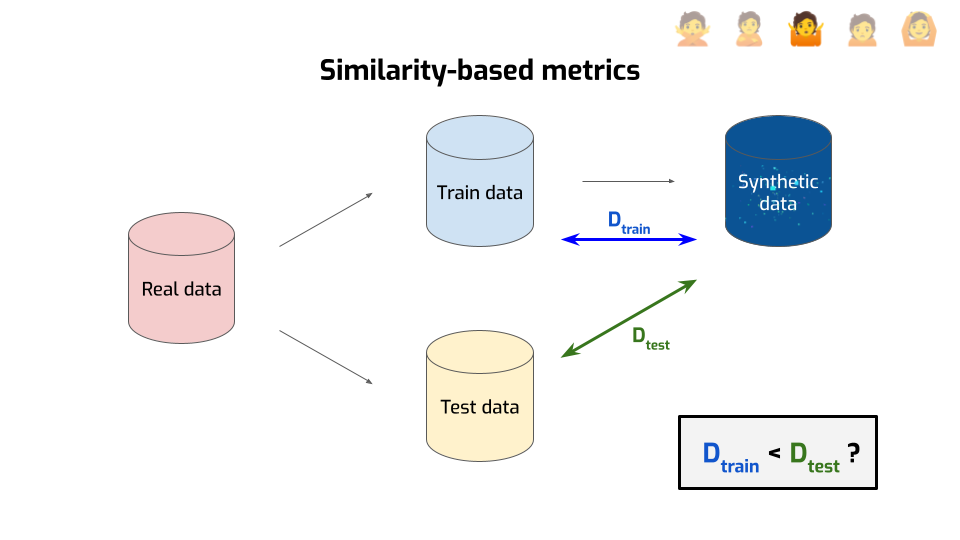
Most people use something that falls into the umbrella of similarity-based metrics. The idea is relatively simple.
First, you take your data and you split it in two parts — the train data and the test data, kind of like you do in machine learning.
Then, you use only the train data to generate your synthetic data.
Then — and this is where it gets interesting — you compute the distance between the synthetic data and the train data. There are many ways to compute a distance between two distributions; you end up with different metrics depending on the distance you choose. But for this explanation, we’ll ignore the details, and focus on the intuition of this distance: it tries to answer the question “am I generating something that’s suspiciously close to the real data?”
But you don’t answer that question directly. Instead, you compute a second distance, this time between the synthetic data and the test data. Now you’ve got two numbers, so you’re doing the natural thing and compare them with each other: is the distance to the train data smaller than the distance with the test data?
If yes, that’s… Is that bad or good? Think about it.
Correct! That’s bad. That means we generated records that are close, not just to the real data, but to the specific points that we used for generation. We didn’t just end up matching the distribution well, we overfit to individual data points. That could be a sign that we leaked some private information. So, that’s bad.
Conversely, if the two numbers are roughly the same, or even if the distance to the train data is larger, that means we’re fine. We didn’t leak any sensitive data. Right?
… right?
Well… not really.

First, it’s easy to cheat at these metrics. All we need to do is to make the distance to the training data large enough, and bam, the metric says we’ve done well. For example, with numerical data, I could just add a large constant number to every record. This way, the data I’m generating is “far away” from the train data. The metric tells me I’ve done a great job at privacy. But… all the sensitive information that was in the original dataset is still in the “synthetic” dataset. I’ve leaked all the information. That’s bad!
Of course, you’ll tell me: “But, Damien, that’s unfair. We’re not measuring the privacy of evil algorithms made by attackers. These edge cases are meaningless. We don’t cheat in real life!”
To which I say: you’re using machine learning! You’re giving your data to a neural network, you don’t really understand how it works, but you tell it: “Go optimize for these metrics. I want good utility and good privacy, and this is how both of these things are defined. Find a good way of achieving both objectives.”
Guess what? Neural networks are going to cheat! That’s what they do! They’re just doing it in a smarter way that avoids obvious detection! So gameability — how easy is it to cheat at a metric — is something you should be concerned about.
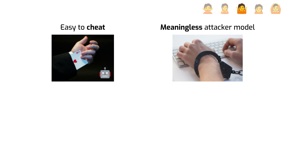
Second: using distances is basically saying that the only thing the attacker can do is “try to find records that are close to real records”. As in, if there’s a synthetic record that matches a real record, then the attacker wins.
But… that doesn’t make any sense! The attacker doesn’t know which are real data points! That doesn’t correspond to something that people would actually do to breach privacy! And attackers can do a ton of things: exploit subtle details of your algorithm, use auxiliary information, or even influence your data sometimes. So using distances is restricting what the attacker is “allowed” to do, without good justification.
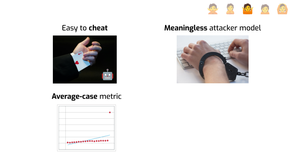
Third, you’re computing a single number that captures a distance between distributions. You got data points on the left, data points on the right, and you’re getting an averaged metric about your system. It’s giving you, at best, information about the average level of “privacy” provided by the synthetic data generator.
But — and I cannot stress this enough — everyone needs privacy guarantees! Including outliers! Especially outliers! If your approach works fine for most people, but leaks a ton of data for people in demographic minorities, that’s bad! In fact, it’s even worse than a system that leaks everyone’s information! At least you’d notice and fix it!
Aaaargh! I thought we were past the anger stage but here you go, I got angry. I told you this stuff was emotional!
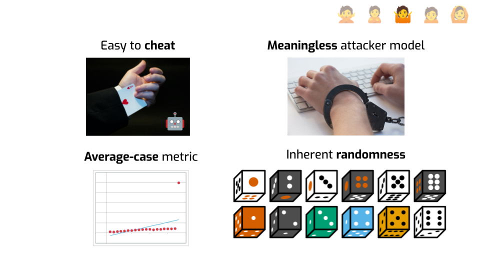
Fourth, and finally, something fun about the empirical metrics used in practice. Try to generate synthetic data and measure its privacy. Then do it again, but with a different random seed, or different train/test data split.
Are you obtaining the same number? Is the thing telling you whether it’s “safe enough” giving you the same information both times?
I’ll spare you the experiment — the answer is “probably not”. Researchers tried it on platforms offered by various synthetic data vendors and got widely inconsistent results. So even if the metric was more meaningful, it’s really hard to trust it if the “things look OK!” signal is super noisy.
OK, so that’s bad. Bad news, though: it gets worse. Because if you think about it, at its core, what are we trying to achieve?
We’re trying to quantify risk. There’s some kind of scale, some end of the scale is great, the other end is bad, and we want to know where we are on that scale. Well, we’ve seen that maybe we’re not exactly measuring risk, more like “risk”, but let’s set that aside.
People building and selling synthetic data are basically telling you: you generate some data and know where you are on the scale. Like, for example, there. You’re in the safe zone. You’re fine. But that’s not what empirical privacy metrics can ever tell you, even if you fix all the problems I mentioned before!
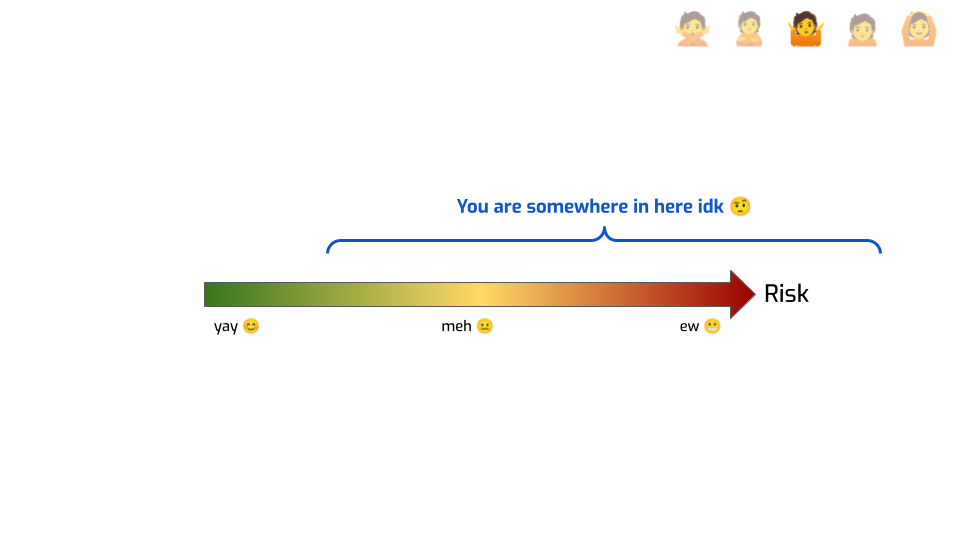
At most, they can tell you something like “you’re somewhere here.” We know for sure that you’re not on the left of this. Maybe we ran an attack and found that this is the success rate of the attack. So it’s at least that bad. We got a lower bound on risk. But we don’t know how much worse this can get! Maybe a better attack would have a much better success rate! We don’t know!
It’s critical to keep this framing in mind when you evaluate privacy claims based on empirical metrics. There are still tons of papers that introduce a new algorithm, compare it to prior work using empirical privacy metrics, and conclude something like “our algorithm is better for privacy”. No it’s not! You don’t know that! At best, this specific attack seems to be mitigated more effectively in this specific context. There’s a crucial difference!
Mitigating specific attacks is useful. By all means, we should do it. But we can’t jump from that to making general claims that we have no evidence for.
OK, so that’s depressing, and we’re not even at the depression stage yet. Let’s be a bit hopeful. What should we do?
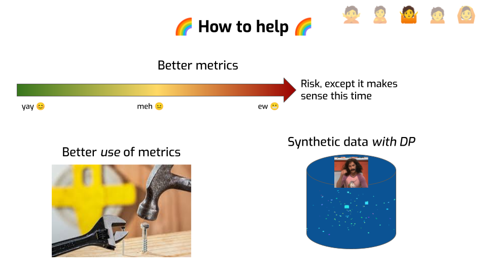
First, we need better metrics with better properties. Metrics should match specific attacks, with clear assumptions about the attacker. They should report the risk to the least well-protected people in the dataset, not the average case. They shouldn’t be too trivial to game, and so on. We’re not yet at a stage where we know what these metrics should be. But the current ones just aren’t cutting it.
Not only do we need better tools, we need to use them better. We should be honest about what they actually tell us, especially if we use them to communicate with people about privacy properties. And we should not use them on their own, but in conjunction with upper bounds on the risk.
Which naturally leads me to synthetic data with differential privacy. There’s a lot of research on the topic already, but there’s so much more to be done. Better tools. Better usability. Better utility for various realistic workloads. Better benchmarks. Capturing functional dependencies, time series. And so on, and so forth. More talking to people who actually need this technology, listening to their needs, addressing them.
There’s a lot more I could say about synthetic data, but you probably don’t want me to at that point. Thanks for indulging me. Now, sadly, we have to move on…
… to Depression.
OK, Damien. I listened to you talk for 30 minutes, and then I was like: Urgh, OK, fine. Stop talking. I’ll do it the right way. I'll use differential privacy, and do whatever is necessary to make it work. No shortcuts.
Except… I’ve been trying for months now.
And there’s just so much garbage in my data. It turns out, my use case is complex. I do have lots of statistics and weird requirements.
I tried all the things that they told me to try in the literature. I used fancy techniques like zero-concentrated DP and dimensionality reduction and adaptive algorithms. I even got some experts to help me. But even with their help, it seems like my problem is impossible to solve. The noise is just too bad.
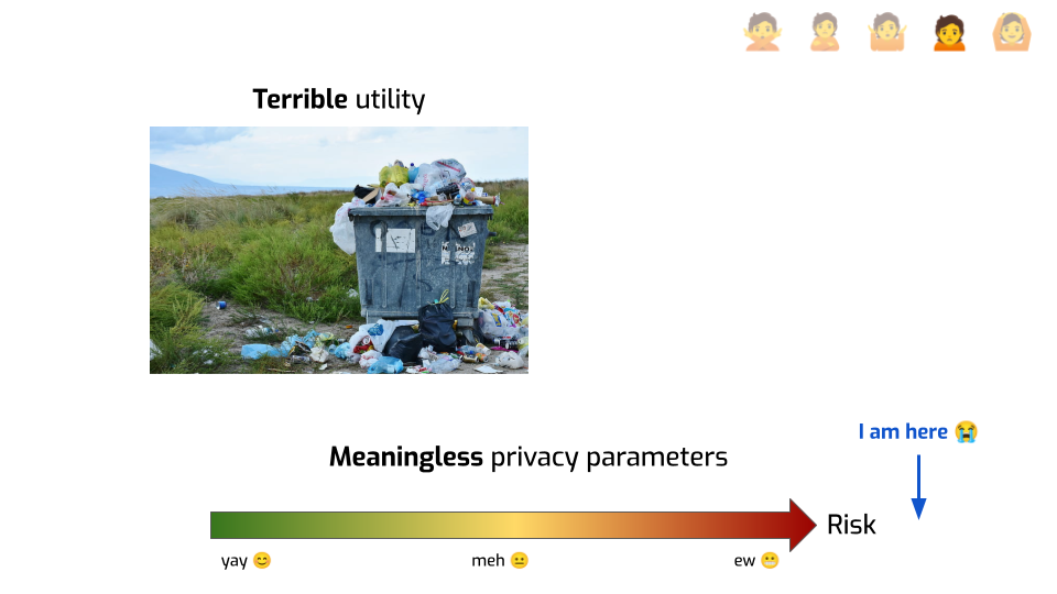
Unless… well, unless I use, like, an epsilon of 30 or anything. But sadly, I understand the explanation of what epsilon means! Kind of. I know that large privacy parameters are basically providing meaningless protection! So why would I even bother, if the best I can do is a number that tells me that the privacy levels are terrible?
I should probably just stop trying to do anonymization altogether and go to the mountains. Raise some goats or something. That seems nice.
Honestly… yeah.
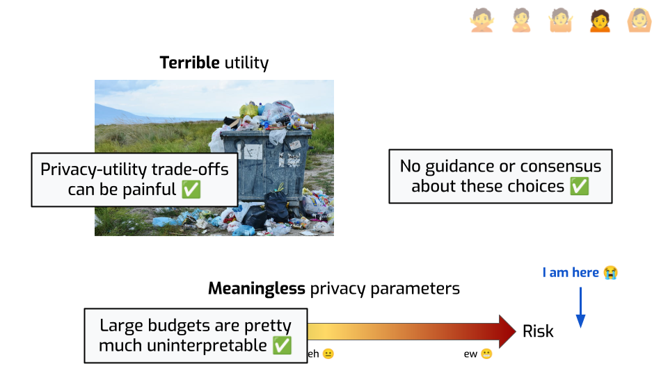
For many problems, the trade-off between privacy and utility can be frankly brutal. That’s just a fact.
And if you give me an algorithm and the only thing you tell me is “it’s DP with an epsilon of 20”… it doesn’t spark joy. There’s no magic explanation that I could give you that would make it acceptable.
Plus, it’s not like there’s good guidance about this, either. If you can use a low privacy budget, you can understand what’s going on. You can rely on the math. But when your epsilon is, like, 10… the math interpretation stops making sense, and what do you have to replace it?
In an ideal world, there’d be some standard that tells you: in this context, under these conditions, an epsilon of 10 is OK. In this other context, you can go up to 15. Even if it feels a bit iffy from a mathematical standpoint, at least there would be community agreement that this is acceptable. People could defend their choices to their executives, to regulators, and to the people in their data. But there’s nothing like that right now. So when people have to face hard decisions regarding parameter choices, of course that can feel hopeless.
Until we have some form of community agreement or standard on what parameters make sense in which context, we won’t solve that problem entirely. But in the meantime, here are some ways we can look at the current situation under a more hopeful lens.
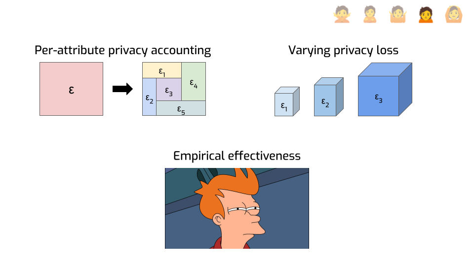
First, here’s an idea that has a lot of potential: privacy analyses don’t need to be limited to a single number. You can do finer-grained things, like looking at the privacy loss of individual attributes instead of entire records.
Say your total epsilon is 10. That seems not so great. But maybe each person in your dataset has 20 attributes. And maybe you can show that if all you do is change a single attribute, then that information is protected with an epsilon or 0.5. Or maybe 1, or 2, depending on which attribute. That feels better: it gives you interpretable guarantees on smaller pieces of information. Maybe that’s enough to give you some peace of mind.
Another idea that is largely uncharted territory today is to have the privacy loss vary across protected entities, instead of being constant on the entire dataset.
This is particularly useful for economic data that is typically very heavy-tailed: one large supermaket might have 1000 employees and millions in monthly revenue, while the mom-and-pop store next door is 500 times smaller. Protecting both at the same time can be tricky, or outright impossible, if we protect them in the exact same way. But it might make sense to adopt a privacy loss accounting framework where the smaller contributors have a better privacy parameter than the large contributors. We’re doing things along these lines with the U.S. Department of Agriculture and the economic branch of the U.S. Census Bureau — come talk to me if you want to hear more.
Finally, and this might sound funny considering everything I told you so far, but… Even with very large epsilons, differential privacy seems to achieve better practical protection than other approaches?
This is particularly flagrant in machine learning use cases. If you want to train a deep neural network with differential privacy, you typically need very large epsilons to get decent results. But somehow, this seems to not only be enough to mitigate practical attacks — at least, those we know of today — but it also seems to work much better than alternative approaches that don’t provide any formal guarantees. I don’t think we have a great explanation for this. My guess is that DP forces you to do some things — like tracking and bounding sensitivity, and adding noise — that are inherently good for privacy?
But my point is that even if you’re a empiricist through and through and you don’t care about formal guarantees, only about making practical decisions… You may still want to consider using differential privacy! It just seems to work better at mitigating attacks, even when it shouldn’t.
How can you help?
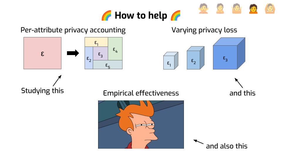
First, what I said about finer-grained privacy analysis — there’s a lot to do here. It’s still largely uncharted territory.
- Some of it is systems design: how to make DP frameworks that make it easy to compute per-attribute privacy loss?
- Some of it is theory. This idea to vary the privacy loss across protected things: we don’t know what are the best mechanisms to do that in practice, and what are the fundamental limitations of the approach. As always with new ideas, we’ll probably bump into more open problems as we try to use this approach to address real-world use cases.
Also, it would be nice to understand better why DP is so effective at mitigating practical attacks. Maybe it’s because it protects against worst-case attackers, and real attackers are weaker than this? In which case, modeling more realistic attackers seems worthwhile, maybe to gain a deeper theoretical understanding of the advantage they can get. This idea is not new; we actually tried to do exactly that during my PhD, but formalizing it and obtaining convincing results seems surprisingly difficult. There’s probably a lot more to be done there.
We’re reaching the end of this talk with the final stage: Acceptance.
I think most people working on differential privacy in academia did not reach this stage the hard way, by going through all the steps that came before, and persevering. Instead, a lot of them were attracted to the abstract properties of this framework. It felt elegant and robust.
… we just like the math, you know?
But more and more, as we ship DP to practical use cases, we see practitioners get converted. Not because all the nice theory, but because of very practical considerations. I count four of them, but I’m certainly missing some.
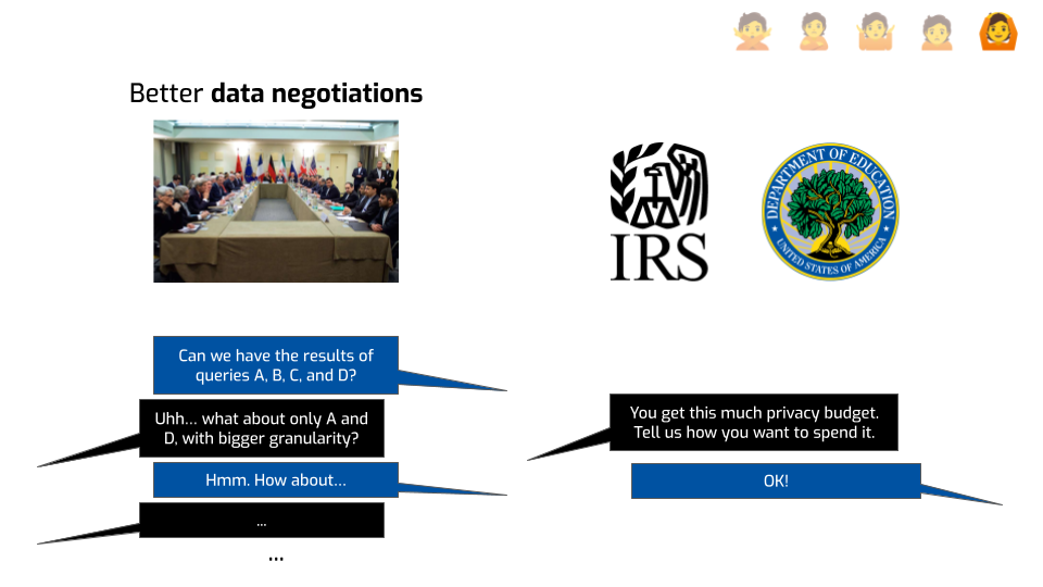
The first one is making data negotiations smoother. What do I mean by that?
We work with the IRS — the tax office in the US — to help them share data with the Department of Education. The Department of Education wants to publish income information depending on degree: when students go to this college to do this degree, how much do they earn on average after 2 or 5 years? This is used by policymakers to better allocate federal resources, and by students to make decisions about their education and the way they finance it.
The Department of Education wants as much income data as possible, as precisely as possible. The IRS, on the other hand, has a constitutional duty to not leak tax information of specific people.
Before using DP, there would be dozens and dozens of emails and meetings back and forth where one side would ask for more statistics and the other would be like “eeeeeh, I don’t know, this seems a bit scary, what if we do something else instead”, and so on.
Differential privacy aligned the incentives. It allowed the IRS to say: “OK, here is your total budget. We’re OK with giving you this much epsilon. You decide which queries you want to run, at which level of granularity, and which queries are more important to you and require more budget.” That saved them a ton of time and led to both better data for the Department of Education, and better privacy outcomes for IRS.
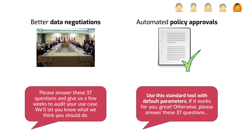
The second also has to do with saving time and effort, in another context: automated approval flows.
When I was at Google, my team was in charge of evaluating and approving anonymization strategies for all other teams. People would come to us, and ask: “we want to share statistics about user data with a third party, or keep some metrics forever, can you please help us anonymize that data?”
When I started in this team, we were using ad hoc methods. Because these methods only make sense depending on context, we had to ask a lot of questions to people. Can an attacker influence the data? Are you using windowed statistics? Are you releasing multiple statistics about the same data point? We had to verify a lot of this stuff by hand, and we could never know for sure that a given launch would not have a bad privacy interaction with another launch from a different team using the same data.
After investing in building DP libraries, we were able to tell people: “Use this library with these default parameters. If you’re satisfied with the result, we’ll approve your launch super quickly.”
Just like before, it aligned incentives, putting individual teams in charge of their own success. You do the work because you have a vested interest in making it work for you. We save ourselves review time, which means we have more time to improve the tooling, which benefits everyone.
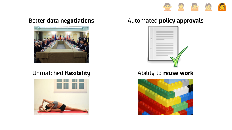
A third point is that DP allows you almost unlimited flexibility about what you can do. It gives you a very clear, well-defined boundary: you have to track the privacy loss of everything. Within this boundary, you can go wild! You don’t need to second-guess yourself every time you introduce a new aspect to your algorithm, or optimize an existing approach. You just need to do the math to quantify how much privacy budget each step costs. That’s really convenient.
Finally, DP makes it super easy to build on other people’s work. It composes nicely, so you can use individual ideas as building blocks, swap one out for another. If you’re using 5 different basic mechanisms in your overall strategy and one of them gets improved in a new paper, you can start using it and get immediate benefits. And once you start having a good overview of what tools are out there, it’s not super hard to start addressing novel use cases — the basic ideas are very reusable and effective.
In conclusion.

I do believe there that there are some real, scary issues with the use of unsafe anonymization practices. It’s also clear to me that the future lies in provably robust approaches, grounded in math, like differential privacy.
It’s not just an intellectual preference or emotional investment — I believe that this is truly the right thing to do from a moral and political standpoint.
But we can’t expect everyone to move there without solving many major problems, like the ones I tried to talk about today.
I think we can actually do this. And I sure hope that you will help!
The inspiration from this talk came from a talk by Andrej Bauer, who used this "Five stages" structure for a lecture about constructive mathematics, later converted into a paper. I heartily recommend both. I hope I did justice to the format.
Thanks a ton for listening. Here’s my email address, LinkedIn, and Mastodon if you want to stay in touch, and a link to my blog post series about differential privacy if you want to learn more about this stuff.
I'm very grateful to Esfandiar Mohammadi for inviting me to speak to this congress, to Gerome Miklau for supporting my preparing and delivering this talk, and to Hari Kumar for his fantastic feedback on this presentation.
Thanks as well to Antoine Amarilli for his helpful comments on this transcript.